Random Bytes

All Things Internet™ since 1999

By

Evolving The Domain Name Experience

(I don’t normally write about Hover here on my own blog, but I really wanted to tell this story and it felt a little bit off-topic for the corporate blog…that, and I need the traffic :-) )

When what we think of as “Domain Names” started up, it was a volunteer side-effort of registering names, one done by hand and totally unreliable in terms of turnaround. You can say what you want related to what came next, but they were kind of Bad Old Days. If a domain was offensive, or they were busy that week, or anything else, you had to basically hope the forces mixed together and you got your domain name. The process of changing domain names, of doing a lot of other domain-related transactions, was weird, slow and stupid.

- Jason Scott

By August 2001, ICANN had still not figured out the policies and process by which registrants could move domain names between registrars. Prior to 1999, there were no alternative registrars and therefore, no domain name portability requirements. With the dismantling of Network Solutions/Verisign’s monopoly over the domain registry/registrar business and the introduction of competitive registrars (ICANN is still sorting out how to introduce competition at the registry level) customers were free to choose who they bought their domain names from and had no freedom if they had previously purchased a domain name from Network Solutions/Verisign.

Now to be clear, domain transfers existed in theory, but not really in practice. In the absence of any standards or defining policies, it was a free-for-all – each registrar was free to make up their own rules – and so they did. Very few names moved back and forth between registrars because of the undocumented practices and intransigence by the incumbent.

As you can imagine, Network Solutions/Verisign (in their registrar role) wasn’t exactly keen to introduce domain name transfer policy and faced with little progress in the discussion, I submitted a draft proposal to ICANN (here’s the original PDF, easier to read) with the goal of spurring discussion. I’ve long believed that victory is often claimed by he who holds the pen, so I never hesitated to draft proposals like this with the goal of defining the policy direction of the ensuing discussion.

By 2003, the policy mechanics had largely been worked out and new policy was implemented.

Thing is, the policy wasn’t well supported by the large registrars. Network Solutions had come around and did a lot of work to come to a set of last minute compromises, but in practice, it was years before their customers were able to easily transfer domain names out. Generally, it was like pulling teeth to get a customer to transfer over from them. Despite the fact that they had a lot to gain, Register.com took an equally customer-hostile stance against domain name portability (which continues to this day in some ways). And at the time, Godaddy wasn’t even on the radar, so they were a non-factor.

Most of what we saw came in the form of the losing registrar putting up roadblocks to make it hard for customers to transfer. Whois access would disappear, data would get changed around, requests were ignored or inexplicably denied – it was all gaming, pure and simple. As the industry grew, the games got more sophisticated but by 2007 or so, all of the localized “rules” that these large players had implemented were well-known and work-arounds could be automated.

Except for registrars who employed what I call “the famous Godaddy lock” – named after the registrar who originated the practice. They do this thing where if you change ownership information on your domain, they lock it down for 60 days preventing you from transferring to a new registrar. This affects *tons* of people trying to move their domains.

Dating back to 2004, ICANN has been explicit that a registrar can only deny a transfer on a locked domain “…if they also provide a reasonable and readily accessible means for name holders to remove the lock status. Registrars who put any names on lock status MUST also provide reasonable and readily accessible means for customers to remove the lock status.” None of these registrars provide any way for a customer to unlock their domain during this 60 day window. Of course, the easiest work around is to update your contact information after the transfer has completed.

Thing is, many, many, many registrants don’t know this and get locked up for far longer than they need to.

We used to get all worked up when registrars made up new “policies” – usually based on some incredibly narrow (and inaccurate) interpretation of what they thought ICANN’s transfer policy said. I would get *really* worked up because not only did I have the policies memorized, but as a draftor, I knew what the *intent* of the policies were. Funny, the creative interpretations were rarely consistent with my intent.

Long ago, I realized that the situation wasn’t going to change. Even if all the existing registrars fell into line, a new one would come along and come up with their own novel interpretation. Failing iron-fisted enforcement by ICANN, domain transfers would never be as easy as they should be.

Which brings me to the point of this post (which is far longer than it should be). The day that we realized that we weren’t facing a policy issue or a regulatory failing was the day we realized that we were facing a customer service issue. Rather than trying to lobby for new policies, stronger enforcement or a political resolution, we simply started doing whatever we could to help our customers.

This generally meant that we’d call the customer and walk them through the transfer, step-by-step and make sure they didn’t click on any little land mines that forced their domain to get locked or the transfer denied. In time, we were able to institutionalize this to the point where now, every customer that transfers to us has the option to do it themselves, or to have us handle all of the little details, in essence acting as the customer’s agent so they can worry about more important things like oh… lunch for example.

The beautiful thing is that we’re able to offer this highly customized and personal level of service to our customers for no extra charge.

I’ve been thinking a lot about customer service this evening, inspired by conversations with customers, and this quote from Jason Scott’s post, “Godaddy SOPA Blah

“DNS and domain name garbage are like funerals and busted water heaters. You don’t want to deal, when you come into problems it’s usually under duress, and when it’s all over you stop thinking about it until the next time.”

We’ve still got a lot of rough edges to sort out – especially when it comes to recognizing that many of the people we talk to every day don’t necessarily *want* to, its because they have to. We’re the plumbers of the Internet, and I’m cool with that. I think we can be the best damn plumbers out there.


By

The Twitter Timeline

Last week I wrote a post about what I didn’t like about the new Twitter design. My argument misses an important point – Twitter is on its own timeline. They are on a journey, just like everyone else, and are moving down the road towards realizing what Twitter ought to be. This recent version of Twitter will not be the last – the product and the company continue to evolve.

Are they moving in the right direction? This article implies they are. Twitter appears to be working on maturing the organization and the product at the same time. These are probably the right priorities – and certainly better than no priorities.

Reading the tea leaves a bit, it appears that for Twitter Inc. revenue is no longer a distraction and that public navel gazing and “star fucking” does little or nothing to contribute to the bottom-line and the future of the company.

Analysing whether or not they’ve made all the right decisions concerning the product misses a big point. Twitter is turning the ship and making progress towards where they need to be. By focusing on their organization, people and execution they are developing broad internal expertise in how they achieve results. This might be the biggest difference between Facebook Today and Twitter Today. Facebook executes, Twitter posts about it. I think this is changing and Twitter is becoming an organization that executes.

If successful, this means the end of the line for all of the weird usability artifacts that the Twitter UI has been wrestling with these past four years. It also means Twitter Inc. will be a vastly improved organization deeply invested in building great products and delivering great service.

This is important for the future of the web. The other large social networks, Facebook specifically, exists to replace the web. Twitter, on the other hand, exists to make the web better. The world doesn’t need another AOL, it needs a better web and if Twitter plays its cards right, they could insinuate themselves with the web in such a way that they become a big part of the social backplane that is evolving to support the Open Web – a role that Facebook appears to have completely rejected in favour of what it views as larger goals.

But that would be the subject of another post completely.

By

Timeline Spam

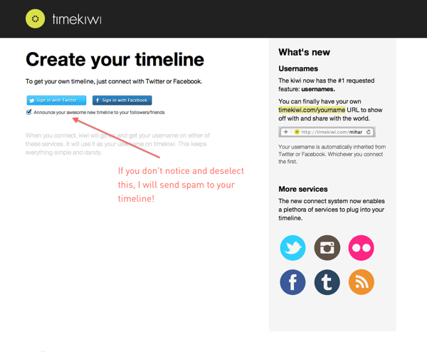
I’m surprised that at this point in 2011 (almost 2012) that companies still think it is smart to sneak stuff onto users timelines when asking for auth information.

It is just as uncool as forcing users to opt-out of mailing lists and other forms of spam.

For example, this signup form for TimeKiwi…

Screen Shot 2011 12 19 at 10 40 39 PM

…stuffed this into my timeline….

Screen Shot 2011 12 19 at 10 49 22 PM

Unless you get explicit consent you’re just making enemies. Don’t do it, no matter how tempting it is.

Thing is, I regularly send tweets pimping apps I like to my timeline… do good things and there’s a pretty good chance that I won’t mind spreading the word at all.

Screen Shot 2011 12 19 at 10 51 37 PM

Just please don’t spam.

By

Things I don’t like about Twitter 4 for IOS

I want to preface this post by saying that I realize that a lot of people put a lot of heart and soul into producing Twitter 4 for IOS. As someone who dabbles in product management, I really appreciate the work that must have gone into releasing this app. I also think you got it wrong and I feel bad for writing a post that essentially trashes your work. Hopefully if you read this, you can absorb these comments in a positive way and agitate for some serious change at the right level in your application.

Twitter has long been criticized for the usability of its web and mobile apps, and version 4 of the official Twitter client for IOS 5 is no different. Instead of improving the user experience, this release makes their service more difficult to use. I’ve long argued that in order for Twitter to create long-term relevance as a company, it needs to provide a simple and useful user experience across all of its interfaces. This means getting away from the geeky user-contributed hacks that sprung up in response to shortcomings in the early versions of Twitter.

In the early days, these little hacks were endearing to the user community. Then Twitter started trying to help its users by integrating some of these functions into their website and mobile applications.

Bad move.

Much of what made Twitter useful in the first place – Hashtags, @user and many other little Twitter specific conventions are hacks that were first adopted by users because Twitter didn’t support several key functions like groups or addressing a note to a specific user. Twitter has made the mistake of trying to integrate these workarounds into the base DNA of their service.

Why is this a mistake? These are hacks, which are by definition “useful but inelegant solutions to a problem“. Not scalable, well-thought-out, simple and commercially sustainable solutions. Useful & inelegant solutions.

Unfortunately recent releases of both the web and mobile clients have strayed away from useful hack and we’re left with something that’s not near enough useful.

Twitter appears to have fallen into the trap of blindly listening to its users and failing to understand what its users are trying to accomplish. Don’t pay attention to what your users ask you for, pay attention to what they are trying to achieve.

I digress. This post isn’t meant to be a dissection of everything that Twitter is messing up in their product architecture – they get a lot of things right and importantly, they have over 500 millions users. All I really want to do is point out a few things that I really, really don’t like about Twitter 4 for IOS 5. I thought it was helpful to provide some context about things I think they are messing up more generally to make it more obvious why I think what I think about what they are messing up with their IOS version.

I believe that much of the confusion swirls around their efforts to simplify features that were poorly conceived to begin with. Moving stuff around on these various screens and giving them different names isn’t going to solve any real problems for Twitter or its users.

First off, if simplifying mobile Twitter was a goal for Twitter 4, then some effort should have gone into making it readily obvious what the @, #, include a picture and geotagging icons in the composition window mean.

IMG 0382

Each of these icons sit at the bottom of the composition window and there isn’t much of an invitation to use them. Even when they are tapped, the function is completely opaque as to what the user should do next. Power users take these meanings for granted and most regular users attribute other meanings to these icons. The @ symbol is most obviously related to an email function, the # symbol could refer to a calculator or a telephone function. Include a pic is probably the best of the four – not much to confuse a user there but right beside it is the geotag icon. It carries no obvious meaning, and even for the most ardent power-users, is so vastly under-utilized that Twitter could probably consider dropping this function entirely.

Twitter 4 uses four top-level navigation cues to help users find their way around the software – Home, Connect, Discover and Me.

Others have gone deep on why that might not be the best method, definitely worth a read. My complaint lies within the Connect tab – I don’t get it.

IMG 0383

As a long-time user, I’ve been able to muddle through the functions on this screen and map them back to old functions, but for a beginning user, the similarities between Connect, Interactions and Mentions is going to be nothing but confusing. These labels will need some substantial rethinking before they are immediately obvious to a user.

And to make it more confusing, Twitter includes a search function in the Connect tab that doesn’t tell the user its a search function. The form field asks you to enter an “@name” (what’s that?) or a full name. For what purpose? A small UI cue would go a long way here.

Further, the Connect tab doesn’t make it obvious at all that most of the tweets and things that are displayed under this tab are interactions that people are having with me, or how they have interacted with my tweets. Sure retweeting is an obvious function for experienced users, but to the neophyte, telling someone that they’ve been retweeted five times is meaningless.

Tapping the Discover tab unveils an even more confusing mess of functionality.

IMG 0385

It shows Stories and Trends and gives the user no idea what these relate to. Can I write a story, is this just for reading? Where are my friends? Are these my trends? Usage stats? What? Ugh. A confusing mess.

IMG 0386

Find Friends and Browse Categories is a lot more obvious, but these are buried down at the bottom of the screen – probably because Twitter doesn’t have much a revenue model around these functions yet. But why is Find Friends and Browse Categories under Discover? Why aren’t they under Connect? Wouldn’t it make more sense to help me connect to people by Finding Friends?

Most of my Twitter use is split between a few accounts. Prior versions of Twitter for IOS made it obvious and easy to switch between accounts. Twitter 4 does not. Guess where its been hidden? As a sub label under “Me”.

IMG 0390

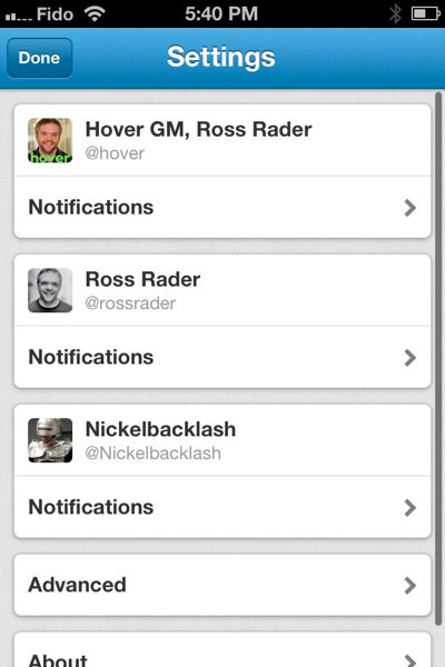
Worse still, click on “Settings” under “Me” (why are settings and multi-user switching buried here at all?) and you’ll see a weird mix of global application settings  (under Advanced) and account specific settings (under notifications).

IMG 0389

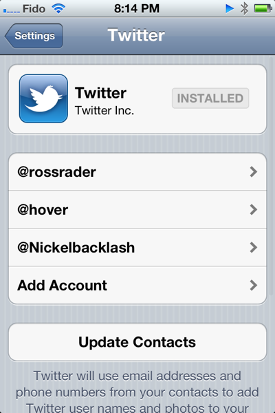
This is in addition to the IOS Twitter settings under System Preferences.

Photo

Why aren’t all of these settings nicely tucked into the IOS System Preferences settings for Twitter? As is, it will be really confusing for users to figure out where they should be going to tweak which settings and provides a user with two different means of adding new accounts to the application.

This is supposed to be “a faster, simpler way to stay close to everything you care about“. I think Twitter has missed that mark by a mile.

It will be extremely interesting to see how the company reacts to user feedback about these changes. At the same time, they’ve announced some pretty sweeping changes to how their website works as well. Their documentation draws some exceptionally clear parallels between the mobile app and the web app. I can only hope that their web app gets it a lot more right than the mobile app did.

My overall feeling is that they are re-arranging the UI deck chairs while skirting the more central issue of how to absorb the early user-hacks into real and scalable features within their user experience.

I suppose I could just uninstall it.