“We have no art, we do everything as well as possible.”
- Balinese saying, /ht David H.
I’ve never understood why perfectly smart people getting paid a good wage don’t check their work before putting it online.
I see it all the time. Last week I read a letter from a high-priced lawyer at Rogers Communication addressed to the CRTC. Purposeful obfuscation aside, it contained at least one silly problem with its construction that someone should have caught before it was released to the public. When I was writing policy documents, I would have died of embarrassment if someone found an error like that *after* I published.
I’m sure my blog and tweets are full of small errors (as David has gleefully pointed out  ), but those things are just for fun – in other words, the stakes are low enough that I don’t feel like I have to obsess over those details.
Its bad enough when obvious flaws in supposedly professional copy get out in the wild, but even worse when those errors are hard-coded into the user experience.
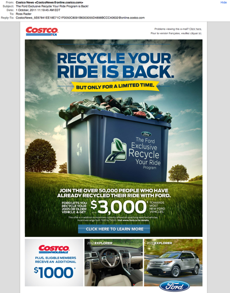
Costco sent out this promo email this morning -
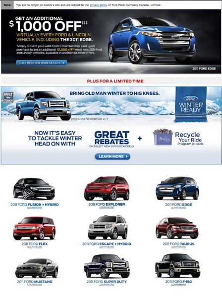
Interested, I clicked the hearty “Click Here to Learn More” in the middle of the page and landed on this page on the Ford website;
Wanting a bit more info, I again clicked on the handy “Learn More” link and this is what came up;
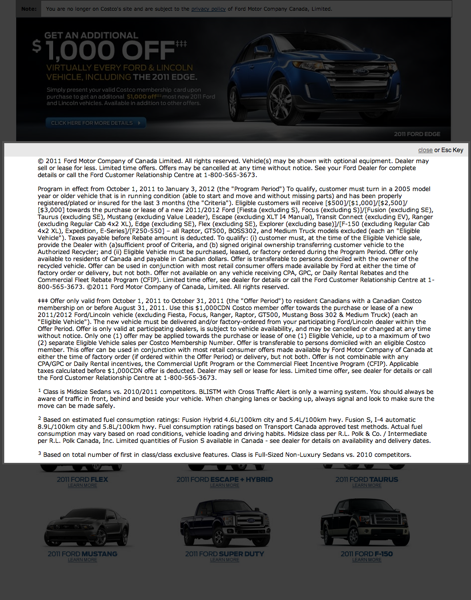
The fine print.
Sigh. Utter fail.
Yes, those are details, but certainly a lot more detailed than I’ve come to expect from using the Web for the past 15 years. Learn more isn’t an invitation to read a contract, its the foreplay you engage in if you want someone’s money.
I didn’t bother hunting around for the correct link – a totally lost opportunity for the marketer that sent this offer to me. Sloppy, expensive and totally avoidable.
Publishing to the web is cheap and efficient. Take some of the extra time you get back from not having to drive down to the printers and check spec sheets and comps prior to the print run and use it to your advantage by double and triple checking what you are sending out there. People notice – your customers notice, your prospects notice and when you do make a mistake, its going to kill your conversions.
![]()
![]()
![]()


Comments…